

What do
Disney's 1951 extravagant rendition of Alice in Wonderland and Quentin Tarantino's martial-arts flick Kill Bill have in
common? As you'll have guessed, it involves a particular use of black and white.
To my knowledge, no other movie has employed it this way – if you know more
examples, please let me know. So let's see what it is and why it is so peculiar.
Filmmakers have variously experimented with combining
color and black-and-white cinematography within a single film since as early as the introduction of color films. A well-known
instance is The Wizard of Oz (1939), which uses monochrome sepia
tones for Kansas scenes, and transitions to color as Dorothy enters the magical
world of Oz. Victor Fleming's film exploits like no other the contrast between
monochrome and color to affirm the supremacy of imagination over reality, and underscore the tension between the innocence of childhood and
the responsibilities of adulthood. Oz is, in fact, the first
of many movies to use the opposition color/b&w to represent different
levels of reality, degrees of fulfillment, or stages of psychological
development. Other random examples include Powell and Pressburger's A Matter
of Life and Death (1946), where otherworldly scenes are filmed in
b&w while earthly sequences appear in color, and Pleasantville (1998), which associates color with happiness
and b&w with disappointment and frustration.
 |
| Dorothy discovers Technicolor. |
B&w has
also become a well-established device for flashbacks. It can be used
occasionally like in A Single Man (Tom Ford, 2009), where a b&w
sequence has the protagonist abandoning himself to nostalgic memories of his deceased
partner; or systematically like in Memento, where b&w
identifies a major plotline. Other times it can express a subjective viewpoint,
or a particular perspective on the world. In John Carpenter's dystopian sci-fi classic
They Live (1988), the screen turns monochrome when
characters are looking through some miraculous sunglasses. More rarely, b&w
can introduce an ambiguity that cannot be easily resolved. For instance, a
scene in Faraway, So Close! (Wim Wenders, 1993) turns from color to b&w as
characters played by Otto Sander and Nastassja Kinski enter a photo booth, as
if we were seeing them through the booth's lens; except that when they collect the
developed photos, these are oddly enough revealed to be in color.

|

|
In more recent years b&w inserts have become a stylish device to pay homage to old movies or provide a playful intermezzo that stands out stylistically from the rest of the movie. Everybody who has seen Death Proof (Quentin Tarantino, 2007) will probably remember the luscious scene where Kurt Russell licks Rosario Dawson's foot, not only because of its fetishism but also because it's the film's only b&w scene.

 |
| The shift to black and white in Death Proof. |
If we
consider that color is one of the main technical aspects of a movie, we would
be tempted to conclude that, in principle, shifting from color to b&w (or vice
versa) always draws attention to the artificiality of film as a medium; but
actually, it depends on what motivates the shift. In A Single
Man, b&w is motivated by a character's memories; clearly the filmmaker doesn't want
to divert our attention from the story. Death Proof foot-licking
scene, instead, is possibly a homage to Russ Meyer's exploitation movies,
therefore motivation has to be found outside of the narrative context. (In
another post I made a similar claim about the diverse purposes behind a
variable aspect ratio.)
But what
motivates the shift to b&w in Kill Bill Crazy 88 fight
scene? The shift occurs as Beatrix Kiddo aka Black Mamba pops out the eye of
one of the gangsters, i.e. in a particularly gruesome moment. Let's put aside concerns
over a possible NC-17 rating, and just concentrate on the effect. At a
superficial level, the monochrome tones down the graphic violence: in fact, the
spurts of blood from the gangsters' severed limbs appear like water gushing
from a fountain once colors have been drained from the screen.

No wonder that many
Tarantino fans were disappointed by this choice (although I'm told that the
Japanese version restores the original sequence in all its gore). But is
violence actually softened by b&w here? This would be true if the whole
film was in black and white. But a single b&w scene stands out in an
unusual way; I'd say that the shift makes the scene even more shocking in this
case, because we are encouraged to imagine what it would
look like were it in color. What might seem like "chromatic
censorship", a sort of b&w curtain rung down to protect the audience's
sensitivity, is actually a way to accentuate the brutality of the fight.
 |
| Kill Bill Volume 1. |
I'm
reminded of when, as a child, I used to watch tv with my grandfather. I often
pressed him to watch horror movies, for which I had an insane passion; and as
he couldn't deny me anything, he usually budged. Except that when a mildly gory
scene came up, he would send me out of the room out of a scruple of conscience,
with the only result that I petrified at hearing the screams and growls coming
out of the screen. It is a principle that every horror director understands
well: what you don't see can be far scarier than what you do see.
I can't
recall, or haven't seen other films employing b&w the way Kill Bill does,
apart from the strange case of Alice in Wonderland. Even
without the scene I'm going to discuss, this 1951 cartoon certainly stands out
as one of the most genuinely bizarre items ever produced by Disney, perhaps
unsurprisingly given the outstanding eccentricity of Lewis Carroll's book. The
scene I have in mind occurs during the famous Mad Tea Party celebration. When
the White Rabbit much against his will joins the party, the Mad Hatter and the March
Hare declare his watch to be two days slow, and attempt to fix it by putting in
it some butter, lemon juice and other ingredients randomly taken from the
table. As a result, the watch "goes mad" and starts to spin and jump
all over the table like a bomb about to explode, until the March Hare makes the
extreme decision to put an end to its sufferings with a giant mallet.
It's a traumatic event, partly for the vehemence of the blow (please remember that we're in a Disney movie), partly because the watch behaves and "goes mad" like a living being. But most importantly, the scene is in black and white, as if life had been washed away with colors, or if the violent hammer blow had damaged the screen itself. The scene lasts about two seconds, then colors are restored. Like in Kill Bill, black and white emphasizes the shock while pretending to mitigate it.
 |
 |
 |
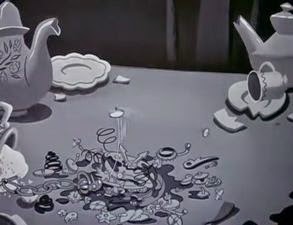 |
It's a traumatic event, partly for the vehemence of the blow (please remember that we're in a Disney movie), partly because the watch behaves and "goes mad" like a living being. But most importantly, the scene is in black and white, as if life had been washed away with colors, or if the violent hammer blow had damaged the screen itself. The scene lasts about two seconds, then colors are restored. Like in Kill Bill, black and white emphasizes the shock while pretending to mitigate it.
Unlike in
the above mentioned examples, the b&w inserts in Kill
Bill and Alice in Wonderland are peculiar in that they
don't serve a narrative purpose: they don't help us contextualize what we
see (Memento, A Single Man) nor they put
us in a character's shoes (The Wizard of Oz). Moreover, shifts
are triggered by intense action (unlike the stylish intermezzo in Death Proof), are not motivated by a particular viewpoint
(They Live, Faraway, So Close!) and preserve
spatial and temporal continuity. Of the two, the Disney sequence seems to me the
purest instance of "chromatic shock" because it hasn't the
complacency and showoffiness of Tarantino's – its justification is purely expressive.
I wonder if more examples exist; it's always difficult to scan your mental movie database in search of occurrences of a specific cinematic device. Please help me find them!
I wonder if more examples exist; it's always difficult to scan your mental movie database in search of occurrences of a specific cinematic device. Please help me find them!
If I had to
pick a chromatic shock from black and white to color, that would be the scene
below from Lost Highway (David Lynch, 1997). This time the term
"shock" is more appropriate than ever.

 |
| Lost Highway. |
No comments:
Post a Comment